
Website Design: Maker Faire Nantes
The Maker Faire Nantes website is reimagined with a focus on community building and learning.
Project Course work for Design Graphic at L’École de Design Nantes Atlantique in Nantes, France
Role UI design and copy writer; Collaboration on site concept and UX with Céline Albert
Skills Research, UX and UI, web design, copywriting, intercultural collaboration
Date 2019
Maker Faire is an international series of events that celebrate the maker culture. These multi-day festivals provide an opportunity for makers to come together to meet, share their projects, and learn from one another.
We were tasked with designing a website for Maker Faire Nantes that would be useful for the community year round, not just surrounding the festival.
Research
This project began with an audit of current, local Maker Faire websites for other cities in France as well as a deep dive into the Maker Faire brand and the concept of the Maker Movement.
Through this research we defined five key priorities of the Maker Faire: openness, sharing, connection, resourcefulness, and active learning. These priorities guided the rest of our work.
Next, we looked at the websites of other similar events and communities. This helped us to identify what makes the Maker Faire unique as well as to get ideas about features that similar communities have available.
Based on our research, we outlined three objectives for our site redesign: promote the sharing of information and learning, facilitate the development of community, empower readers to pursue their interest in making.
New Site Features
We developed concepts for a variety of features that could be added to the Maker Faire Nantes website. We expanded the following three:
Maker Story
In our research, we struggled to find a single, unified introduction to the Maker Faire and Maker Movement. Instead, we had to read several separate websites and build our understanding slowly. This can make the fair and movement feel confusing and inaccessible.
To combat this, we created a clear introduction that a user can read to gain an understanding of the Maker Faire and community. To emphasize the openness of the community, the user is emphatically invited to join in and provided with actionable ways that they can do so.


Hand drawn illustrations and a simple layout help to make the information feel welcoming and accessible.
Maker Map: Nantes
There are lots of interesting events, resources, and workspaces in Nantes. However, if they are not visible the community can feel inactive.
To address this, we created the Maker Map. Makers can use this map to discover things that may be useful to them in Nantes.
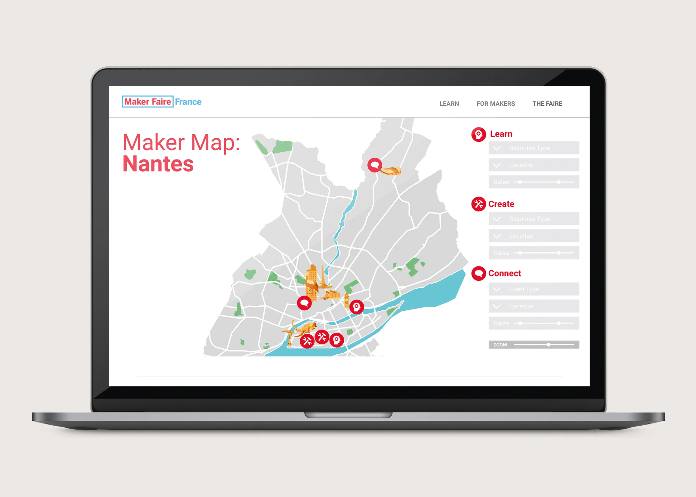


The map is intentionally visual to help users picture the maker community activity in the city and help them discover new things. Visualizing where locations are relative to well known and relevant landmarks can make going to new places feel easier, promoting engagement. Encouraging the congregation of makers in real life, outside of the faire, can help to strengthen the local community.
Maker Mentorship
One of the key parts of the Maker Faire is the exchange of knowledge between attendees. In order to extend this throughout the year, we carried it over on to the website.
Maker Mentorship provides a platform for makers to connect, whether it is a newer maker connecting with a more experienced maker to ask a question or two makers coming together to collaborate. To expand the exchange of information taking place on the site, questions and answers can be publicly posted for the broader community to learn from.


The interface for this feature emulates a group of people to help create a natural, human feeling as the user looks through the participating makers. Users can see connections between other makers, reinforcing feelings of community.
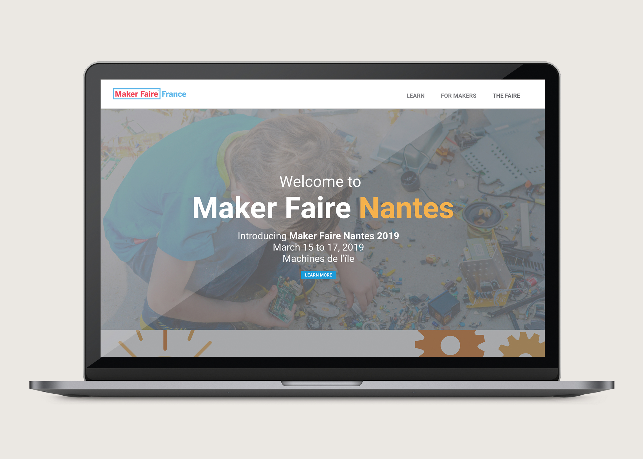
Overall Site Design
Finally, we considered how the site could be redesigned, including its organization and graphic style.
Many of the other Maker Faire websites that we looked at were difficult to navigate making it hard to access content and resources. In response, our biggest priority was to create a clear, easy experience for users.
We opted for a simplified graphic style on the website to keep the focus on the content. To ensure that the site was clearly recognizable as Maker Faire, we used their current brand colours and logo.


We simplified the organization by nesting all pages under three categories: Maker Story, for those who need an introduction to Maker Faire; For Makers, containing resources for makers; and Maker Faire Nantes, containing information about the faire itself.

I worked on this project with one of my French class mates, Céline, while I was studying in Nantes, France. I really enjoyed the opportunity that this collaboration provided for us to learn about both design and working in each other’s cultures.
All of the illustrations in our project are by Céline. You can find more of her work here.